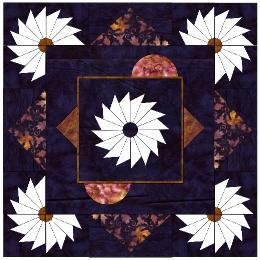
This is my second choice. It continues the dark blue background but adds the focus fabric in a way that gives an on point feel to the square. It is just a little more plain than I would like with the blue background. | This is a distant third place. I think that the tan color might be a little too bright for this. The color is actually a little more yellow than it appears on my screen. |
|
|
This is also a second choice. I like the use of the focus fabric but I miss the extra triangles of blue that I think give just a little more interest to the piece. | Afte some consideration and looking at the focus fabric I think this is my favorite. The focus fabric is not as busy as it seems in the scan and I like the use of the background to give an on-point feel. |
|
|
I like the thought of putting this on point. My first reaction when I saw the piece was that it should be put on point. | |
|
|
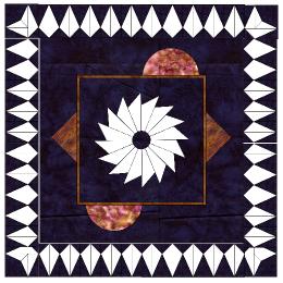
Yet another choice. The kites could be random colors or could be the blue background. | The small kite version for comparison. Also with the blue background rather than the focus fabric. |
|
|